Bigger Burgers
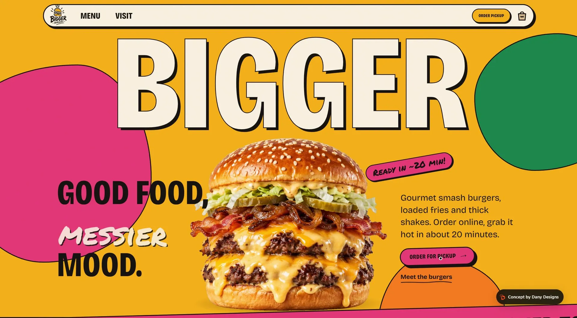
A loud, graphic ordering site for a smash-burger spot: every burger is a character that bursts into its layers, and pickup orders go from menu to confirmation in four steps.
A concept build made to show what I can do for a brand in this market. The brand and people are fictional.
- Services
- Web Design, eCommerce
- Year
- 2026
- Location
- Concept
- Platform
- Astro · GSAP · Vercel
The challenge
Burger places all look alike online: a dark photo, a PDF menu and a phone number. A pickup spot needs a site that feels like the brand and turns hunger into an order in under a minute.
The approach
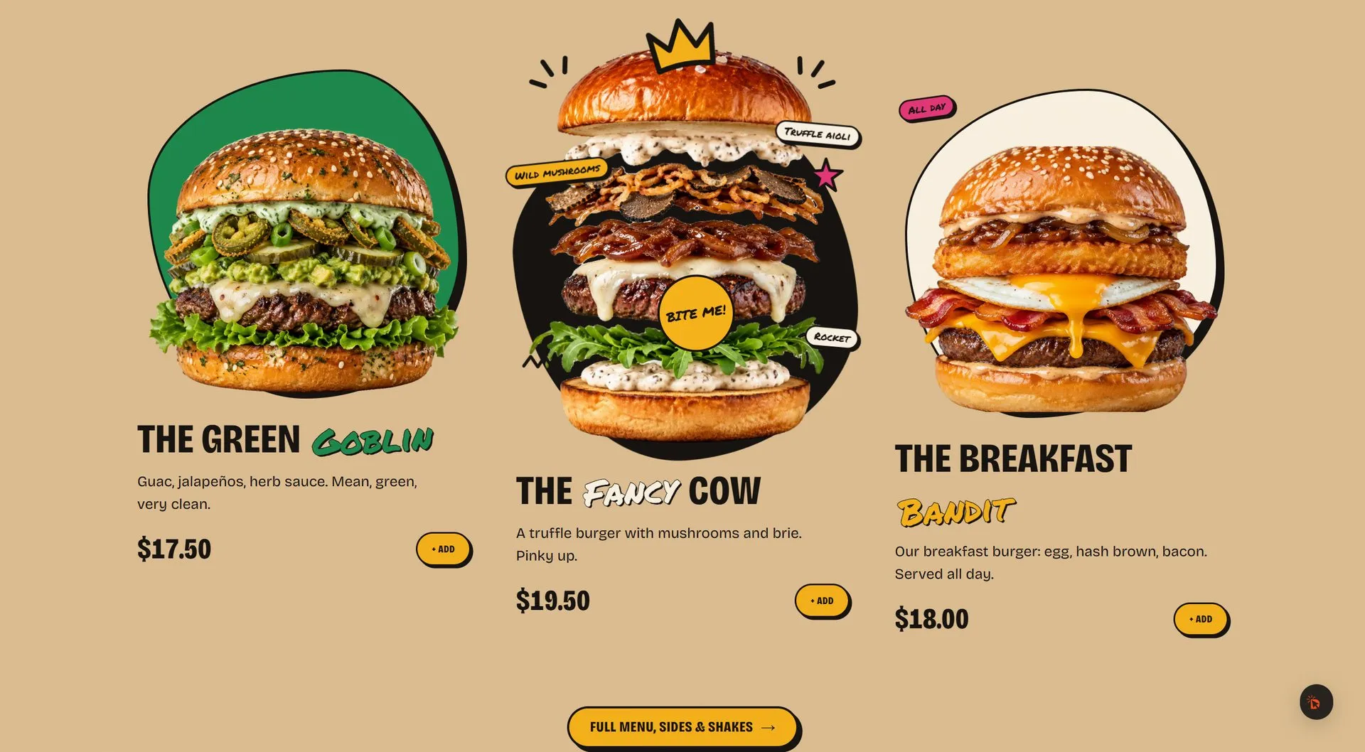
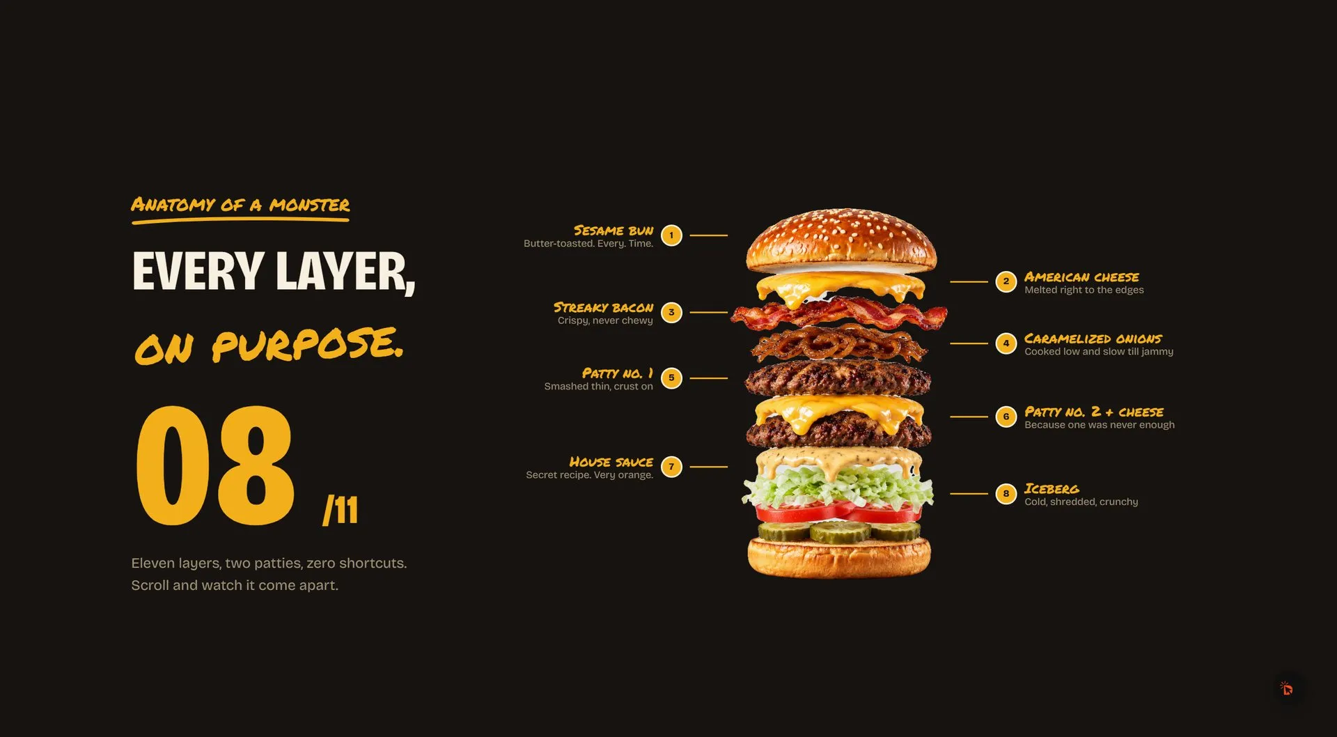
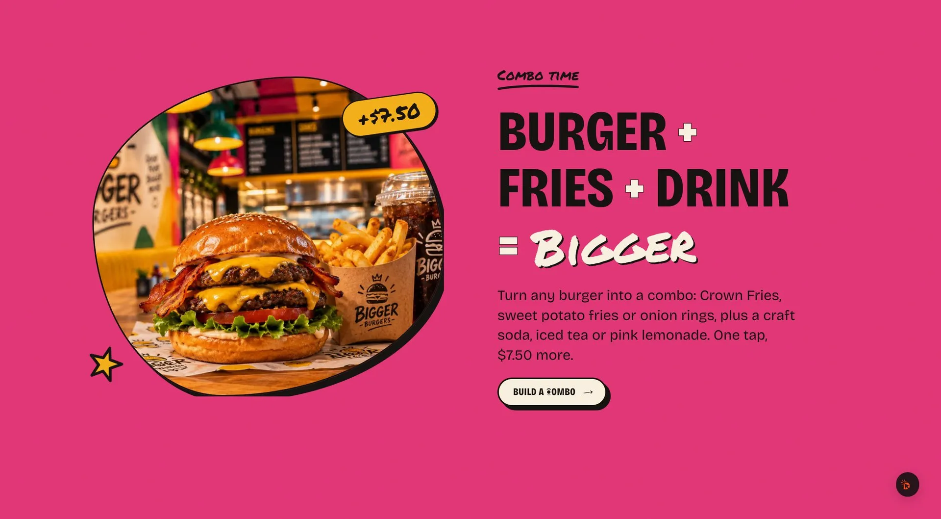
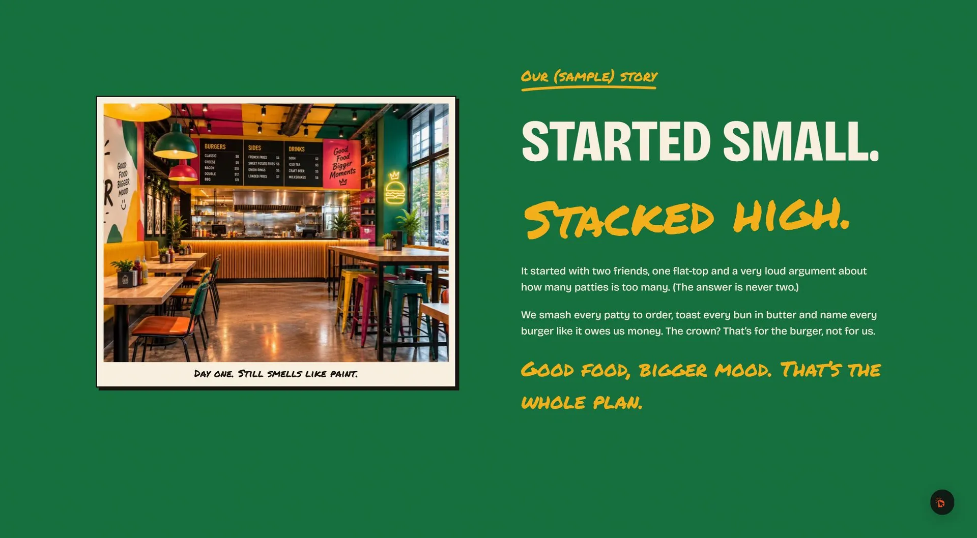
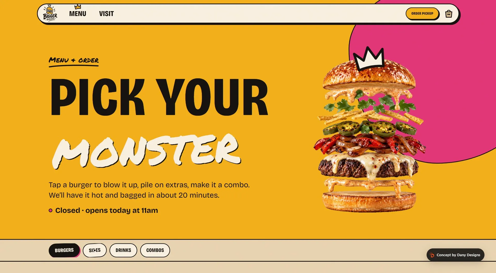
We designed the site like the packaging: kraft paper, colour blobs, brush lettering and a crown on everything. The motion is springy instead of slow and luxurious: burgers squash and explode on hover, the background changes colour as you scroll, and the order flow stays short and readable on a phone.
On the phone
Perfect on every phone
Most visitors arrive on a phone, so the site is designed there first: fast to load, easy to read and one thumb away from booking or buying.

The live build
See it in motion
Screen recordings of the real site, unedited: scrolling, animations and page transitions exactly as a visitor sees them.
What moves
- 01
Explode on hover
Each burger squashes, springs into its layers and throws doodles, on hover or tap.
- 02
Burger that stacks itself
A short preloader where the bun, patty and cheese drop into place.
- 03
Order for pickup
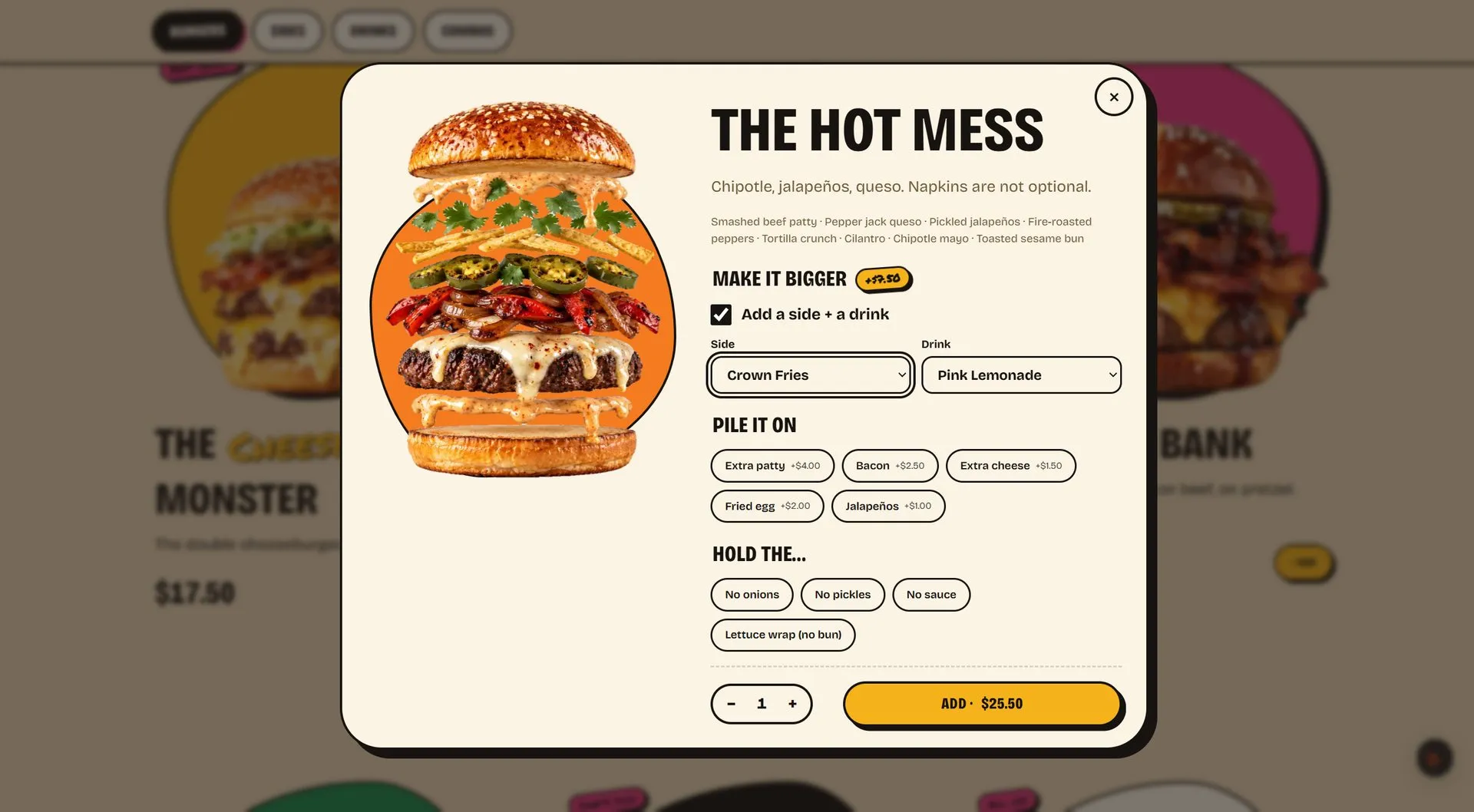
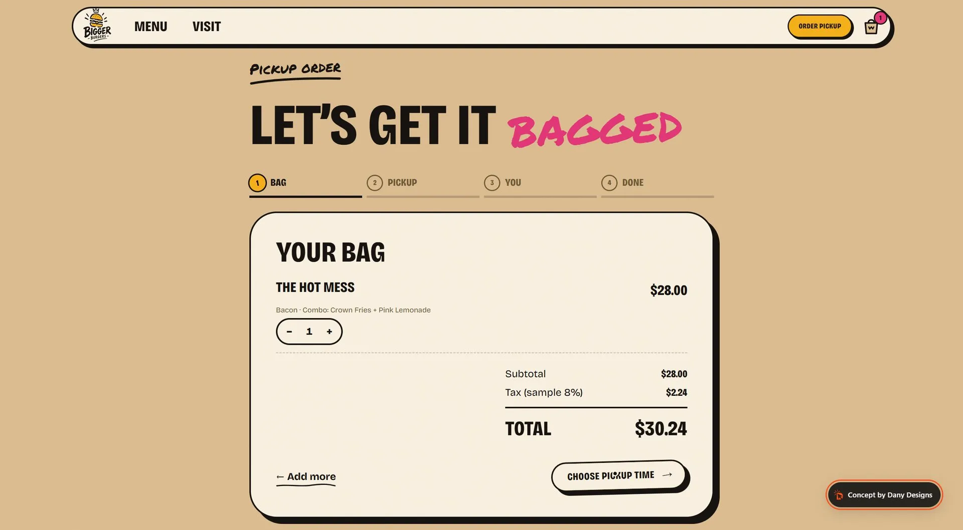
Item sheet with add-ons, cart drawer and a four-step checkout with pickup times.
- 04
Built for the phone
A sticky bar with Order, Call and Directions, and tap targets sized for thumbs.